

Note: this is a new series for free subscribers and is intended to give an insight into the work that goes on at Topdown Charts (+deliver some useful and timely takeaways).
Chart: Deep Value in LatAm Equities
The latest hot topic in Global Equities is LatAm, and for good reason.
EWZ (Brazil) jumped +20% over the past 2 weeks, and ILF (LatAm40) is up over 25% YTD. Big moves, especially for an often overlooked part of the markets — but the follow-up question is this: did we miss it? is it already done? (…or is there room to run?)
This week’s chart goes a long way towards answering that question.
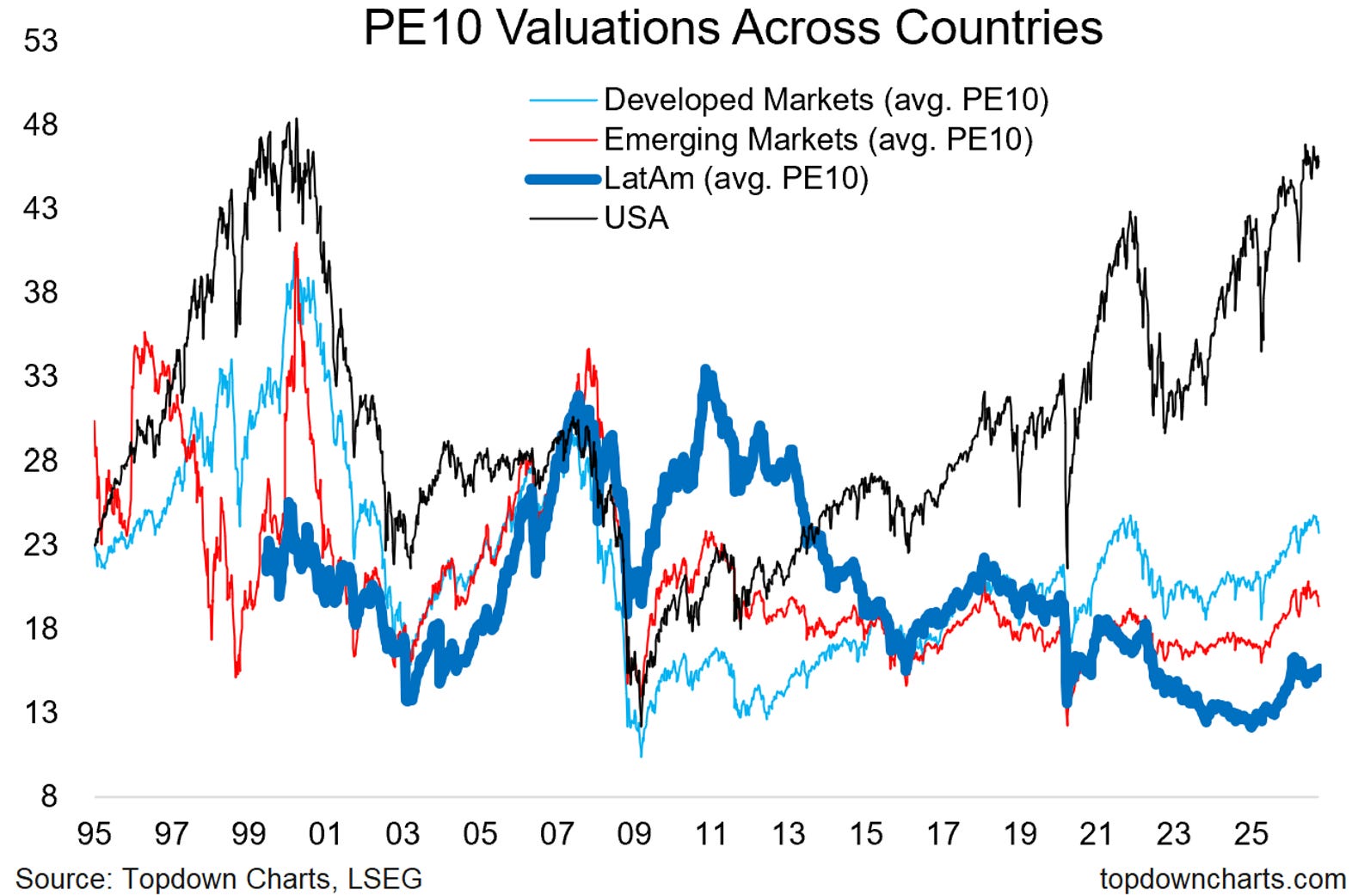
The chart shows the PE10 or price vs trailing 10 years average earnings (also referred to as the Shiller PE or CAPE: cyclically adjusted PE) —the point of the PE10 is to correct for the distorting effects of cyclical swings in earnings that you often get with the forward or trailing 12month PE ratios.
But the key point is the average PE10 across LatAm (this case = Brazil, Chile, Colombia, Mexico, Peru) is looking cheap vs its long-term average, and cheap vs the average for EM as a whole, and wildly cheap vs their peers to the North (US trading at a PE10 about 3x that of the LatAm average).
This is the part where folk will say, well yes of course, the USA should trade more expensive because it’s focused on Tech/Growth.
Meanwhile LatAm (ILF etf for example) is ~40% Financials and ~35% Energy & Materials (commodities), so a heavy skew to commodities —which at a time of strong updrafts in commodity prices is arguably a feature vs bug.
But to get back to the question,
On a PE10 basis LatAm is cheap.
Plenty of room to run to get back to average and/or even with peers.
Latin America Equities — What do you think?
(What’s your core-view/how are you positioned on LatAm Equities?)
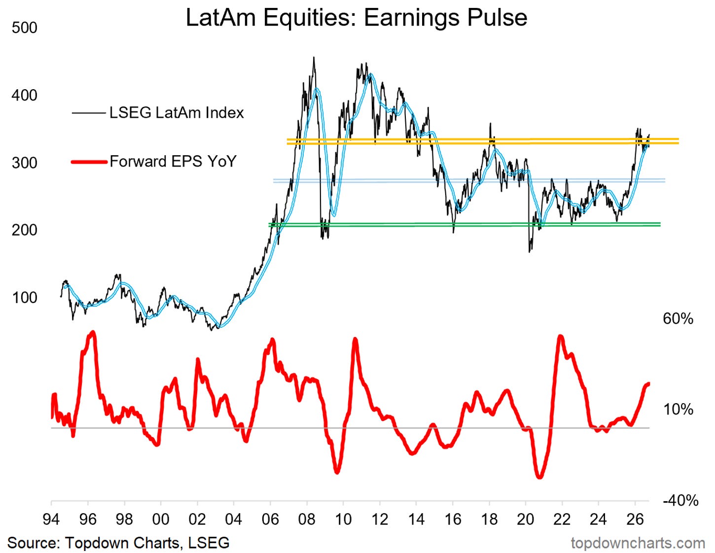
Bonus Chart: Overhead Resistance…
The former support line during the early-2010’s has become a powerful zone of overhead resistance. Ideally I want to see the index make a clean and clear breakout through that level to gain maximum bullish conviction.
I'd also like to see commodities push beyond the all-time highs, and global growth resilience to pass a couple of impending tests to give an assist here… monitoring the situation.
Weekly Report Notes
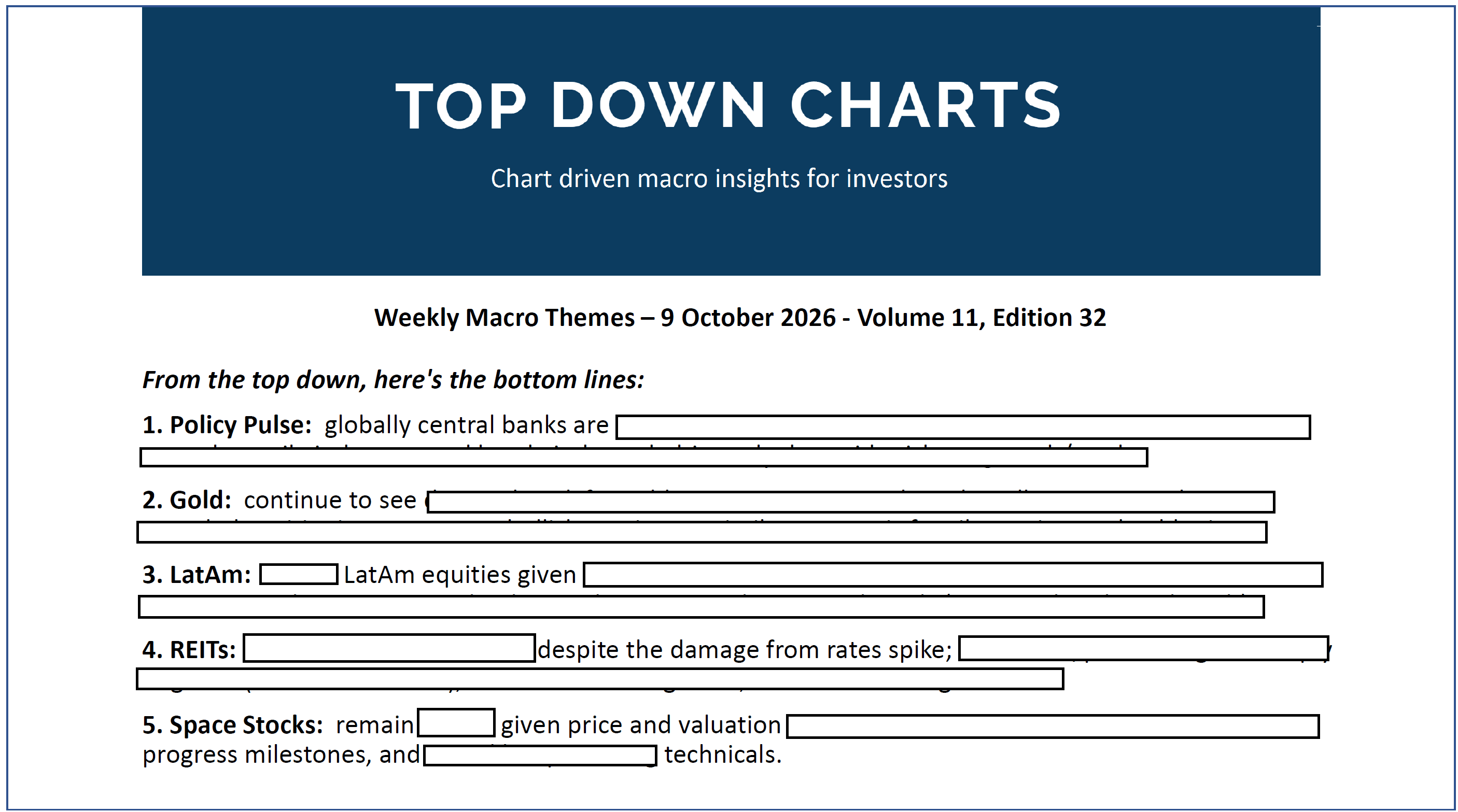
Here’s a preview of the topics covered in my latest report [Global policy pulse, Gold price outlook, LatAm equities, REITs, and Space Stocks] — it should give a good sense of what I tend to cover in the TD Pro service:
Subscribe to unlock the latest report + full report archives + recently released Quarterly Strategy Pack and webinar replay: US$3500/year (or $350/monthly on a month-to-month basis).
Topdown Charts Research Digest — Archives
Click through for more free updates and insights from Topdown Charts:
Thanks for reading! Reply to this email if you have any questions.
—
Best wishes,
Callum Thomas
Head of Research at Topdown Charts
Connect: LinkedIn | Twitter/X | Substack
p.s. What do you reckon?
Please provide feedback below (reply by email if you had any specific points)
Also, in case you missed it: be sure to check out the previous note — in this post you will find more macro market musings + a key chart outlining the risks vs opportunities in gold vs bonds…
![[Chart] Gold vs Bonds](https://substackcdn.com/image/fetch/$s_!XkkB!,w_1300,h_650,c_fill,f_webp,q_auto:good,fl_progressive:steep,g_auto/https%3A%2F%2Fsubstack-post-media.s3.amazonaws.com%2Fpublic%2Fimages%2F4fa3b7fe-038f-4d02-96f3-e71f9cd63648_1395x922.png)
Learn more about Topdown Charts —> this post explains what Topdown Charts does + The Topdown Charts Framework for monitoring macro & markets to consistently generate profitable ideas:
