

Note: this is a new series for free subscribers and is intended to give an insight into the work that goes on at Topdown Charts (+deliver some useful and timely takeaways).
Chart: Gold vs Bonds
This may be the most contrarian piece of information you’ll see this year.
Gold looks expensive.
Bonds look cheap.
Interestingly, both have actually been a losing position this year, with gold down -4% YTD and long-term treasuries down -11%. The difference is one is nearing the end of a prolonged bear market, and the other is just beginning.
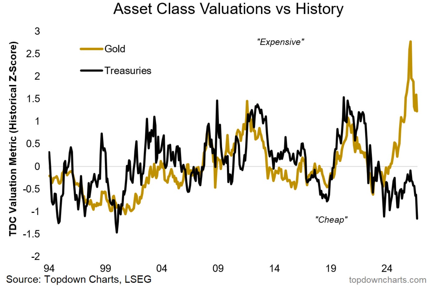
The most contrarian trade right now would be short gold vs long bonds.
But just because something is contrarian doesn’t mean it’s right. The rest of the elements need to fall into place. Coming from a starting point of valuation-extremes like that on display in the chart above certainly sets the scene, stimulates the imagination, and helps form future expectations.
The next piece to consider is the relative price performance line.
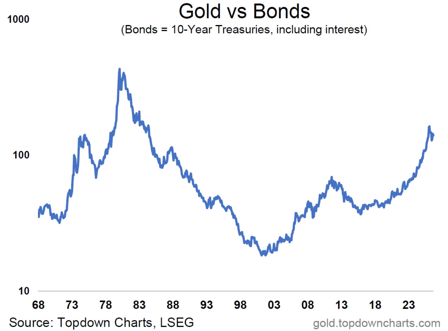
Gold has a habit of undergoing multi-year waves of outperformance vs bonds e.g. twice in the 1970’s, the 2000’s bull-run, and now again in the 2020’s.
The current run in gold vs bonds has actually already peaked following similar scale moves in terms of duration and magnitude as the previous waves.
It may not be a popular or comfortable viewpoint, but the datapoints are steadily lining up. And in the end, contrarian investing is not supposed to feel nice, it usually requires you to take the most uncomfortable position. That’s why you have to be data-driven and evidence-based in your approach so that you can make the move when the puzzle pieces all line up… even if you don’t like the picture.
Gold vs Bonds — What do you think?
(Gold vs long-term Treasuries: what’s your view/how are you positioned?)
Want more ideas like this?
+more detail on tactics, timing, and progress updates along the way?
In my research service, TD Pro, I cover issues, trends, themes, and ideas like this as a matter of routine. I cover all the angles from valuations to monetary/policy moves, cyclical-macro considerations, positioning & sentiment, and technicals.
This helps clients get the full picture in minutes, and helps set in motion trades that keep delivering over months. And with regular updates, you’re never left guessing whether it’s still the right position, or whether it’s time to take profits or cut losses. I scan global markets and macro to bring you the best ideas every week.
Sign up now to get a better flow of ideas and insights:
But be sure to sign up before the 8th of October, which is when I’ll be taking clients through my 2027 Outlook + Q4 tactics.
Report Preview — Quarterly Strategy Pack
Here’s a preview of my latest report —it should give a good sense of what I tend to cover in the Topdown Pro service:
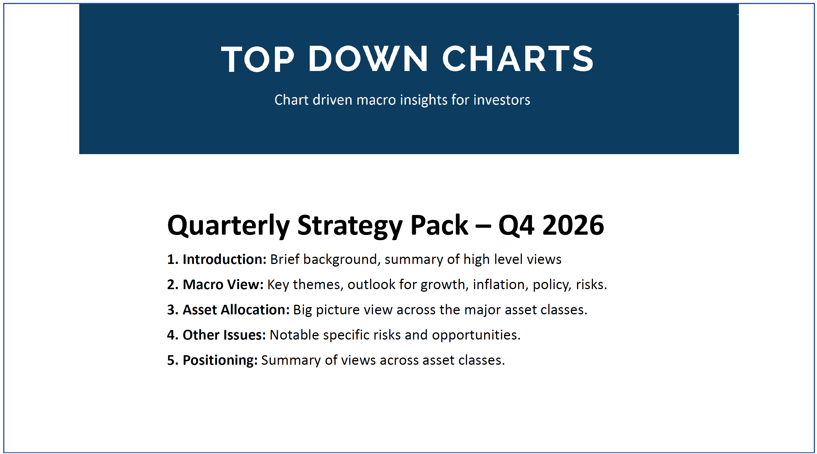
Here’s specifically what I covered in the Q4 Strategy Pack:
What’s happening with policy
Upsides and downsides of bonds
Outlook for gold prices and tech stocks
Real estate, energy stocks, emerging markets
Whether or not and when to go max growth vs defense
Risk radar, TAA positioning guide, capital market assumptions
Upgrade to Paid now to instantly access the Q4 slide deck + join the webinars later this week — [Click here to Subscribe]
Thanks for reading! Reply to this email if you have any questions.
—
Best wishes,
Callum Thomas
Head of Research at Topdown Charts
Connect: LinkedIn | Twitter/X | Substack
p.s. What do you reckon?
Please provide feedback below (reply by email if you had any specific points)
Also, in case you missed it: be sure to check out the previous note — in this post you will find some key charts and insights on investor positioning and why most people are running a trifecta of max risk + min defense:

Learn more about Topdown Charts —> this post explains what Topdown Charts does + The Topdown Charts Framework for monitoring macro & markets to consistently generate profitable ideas:

.