

Note: this is a new series for free subscribers and is intended to give an insight into the work that goes on at Topdown Charts (+deliver some useful and timely takeaways).
Chart: Valuations & Allocations
The chart below should be studied carefully by every student of the markets.
It tells us a lot about how markets move, how things change, how investors behave, and how to think about markets as a long-term active investor.
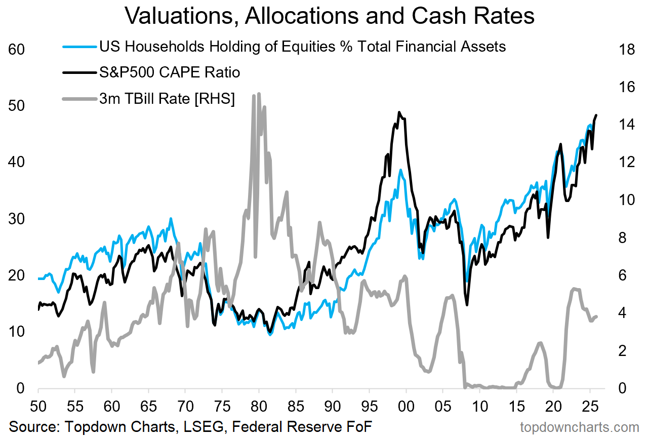
You probably have a few of your own views and ideas when you look at this chart —but here’s some thoughts that come to mind for me:
Investor Behavior: everyone wants to own stocks at the top (when valuations are high), few want to own them at the bottom (when valuations are low).
There -is- An Alternative: the 1970’s-1980’s period saw a structural decline in stockmarket valuations (and allocations to stocks) and the alternative of double-digit interest rates played a massive role (if you can get doubled digit returns on cash with no risk that’s a better deal than risky stocks, also if you have a mortgage with a double digit interest rate it pays much better on a risk-adjusted basis to pay down debt than own risky stocks).
Secular Shifts Still See Cycles: throughout the secular macro/market regime shifts in this chart, you can still see clear cycles [Stockmarket: peaks and troughs in valuations, Economy: rise and decline in cash rates]. This is a good thing for cycle-aware active asset allocators (but also; beware that cycle peaks/troughs tend to be accentuated and extended around regime shifts).
Market Drift is an Active Decision: if the value of your stock holdings go up relative to everything else you own, and you have not made any adjustments then you have let the market take your allocation/weighting to stocks up — this is an active decision because you could have decided to trim or rebalance. Most people don’t know they are making this decision.
Mean Reversion Happens Slow and Fast: valuations reverting back to the mean from cheap or expensive can be a very slow process (e.g. staying cheap from 1975 to 1985, or expensive from 1995 to 2000), but also a very fast process when it finally begins to happen (when the market peaks and rolls over it often drops faster than it climbed, and then the market bottoms it’s almost always also a rapid rebound from extreme fear).
This is some good food for thought, but it also makes you wonder…
…with US Household allocations to equities at record highs (institutional investor allocations at the highest levels since 2000), and valuations pressuring the all-time high for US equities — what does history suggest we do now?
I would say based on my observations above: beware of valuation mean reversion (to the downside), be cycle-aware (take note of interest rates and alternatives, signs of weakness in the economy, price/trend developments in the stockmarket), examine your asset allocations and whether they make sense given the risk vs reward possibilities, and above all have a plan, a process, and a healthy dose of pragmatism.
US Stockmarket Valuations — What do you think?
(is the US Stockmarket too expensive? +if so: what are you doing about it?)
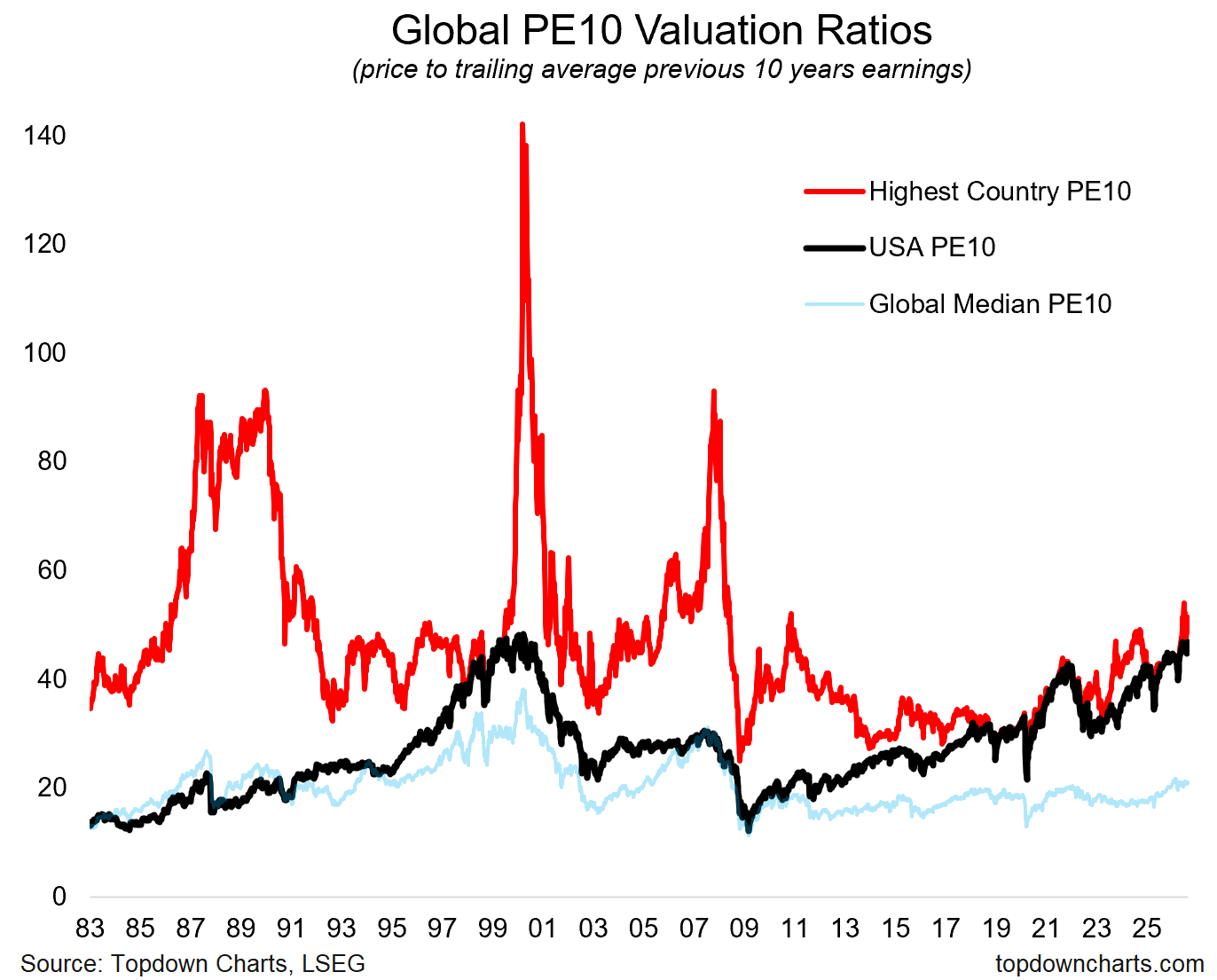
Bonus Chart: How High Can You Go?
The chart below shows the highest country PE10 ratio across time [with revolving membership] (e.g. standouts: Japan in the 1980’s, Finland in 2000, China 2007, Colombia 2010, India 2024, and more recently Taiwan & Korea + USA). The countries represented in the red line changed often.
The key point is throughout this period there has very often been a country trading on a PE10 ratio in excess of 40x, and on occasion much higher.
Overall I would call this chart an exercise in imagination expansion…
(as I quipped yesterday: sometimes the unthinkable is simply a lack of imagination)
And now onto the usual weekly report highlights — be sure to provide feedback further below if you have any +questions always welcome.
Weekly Report Notes
Here’s the topics & takeaways from my latest report —it should give a good sense of what I tend to cover in the Topdown Pro service as well as providing some high-level insights into how I am currently seeing Macro & Markets:
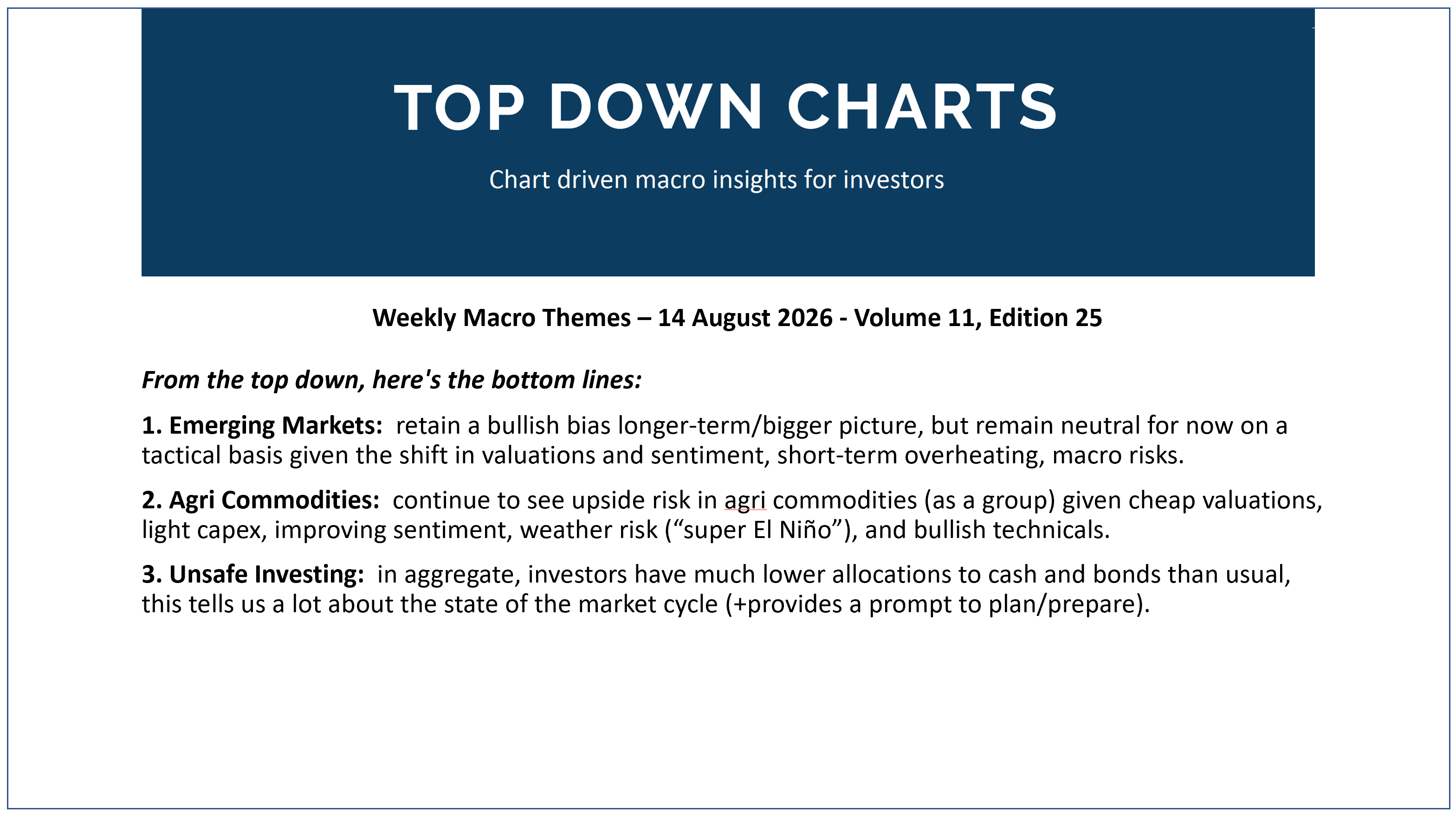
1. Emerging Markets: retain a bullish bias longer-term/bigger picture, but remain neutral for now on a tactical basis given the shift in valuations and sentiment, short-term overheating, macro risks.
2. Agri Commodities: continue to see upside risk in agri commodities (as a group) given cheap valuations, light capex, improving sentiment, weather risk (“super El Niño”), and bullish technicals.
3. Unsafe Investing: in aggregate, investors have much lower allocations to cash and bonds than usual, this tells us a lot about the state of the market cycle (+provides a prompt to plan/prepare).
Thanks for reading! Reply to this email if you have any questions.
—
Best wishes,
Callum Thomas
Head of Research at Topdown Charts
Connect: LinkedIn | Twitter/X | Substack
p.s. What do you reckon?
Please provide feedback below (reply by email if you had any specific points)
Also, in case you missed it: be sure to check out the previous note — in this post you will find more macro market musings +some key charts on the outlook for Gold vs Bitcoin [and last week’s survey results!!]
![[Chart] Gold vs Bitcoin](https://substackcdn.com/image/fetch/$s_!Ubv1!,w_1300,h_650,c_fill,f_webp,q_auto:good,fl_progressive:steep,g_auto/https%3A%2F%2Fsubstack-post-media.s3.amazonaws.com%2Fpublic%2Fimages%2F6d57a989-94d8-4b72-abe1-1dec4006bf76_1150x782.png)
Learn more about Topdown Charts —> this post explains what Topdown Charts does + The Topdown Charts Framework for monitoring macro & markets to consistently generate profitable ideas:

Topdown Charts Research Digest — Archives
Click through for more free updates and insights from Topdown Charts:
Thanks for reading, learn more: about Topdown Charts