

This week we’re looking at how the global capex boom is driving bond yields higher (+clues on the next steps for bonds).
The chart below shows the 5-year annualized growth of Capital Expenditures by global listed companies vs the global average 10-year government bond yield.
There is a strong link between the two, and I’ll explain why.
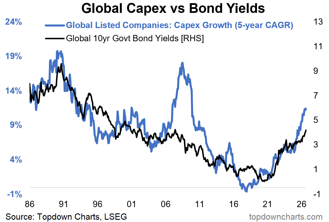
But first, what’s up with that big disconnect in 2007-2011?
(because sometimes the exception helps explain the rule…)
That particular period saw a couple of things happen: first, capex during that period was heavily driven by the commodity sectors, and commodity prices were surging (e.g. crude oil prices going up 2-3x); which put the brakes on growth —just as central banks had aggressively tightened monetary policy… and then of course came the global financial crisis (+lingering aftermath).
All of which put downward pressure on bond yields.
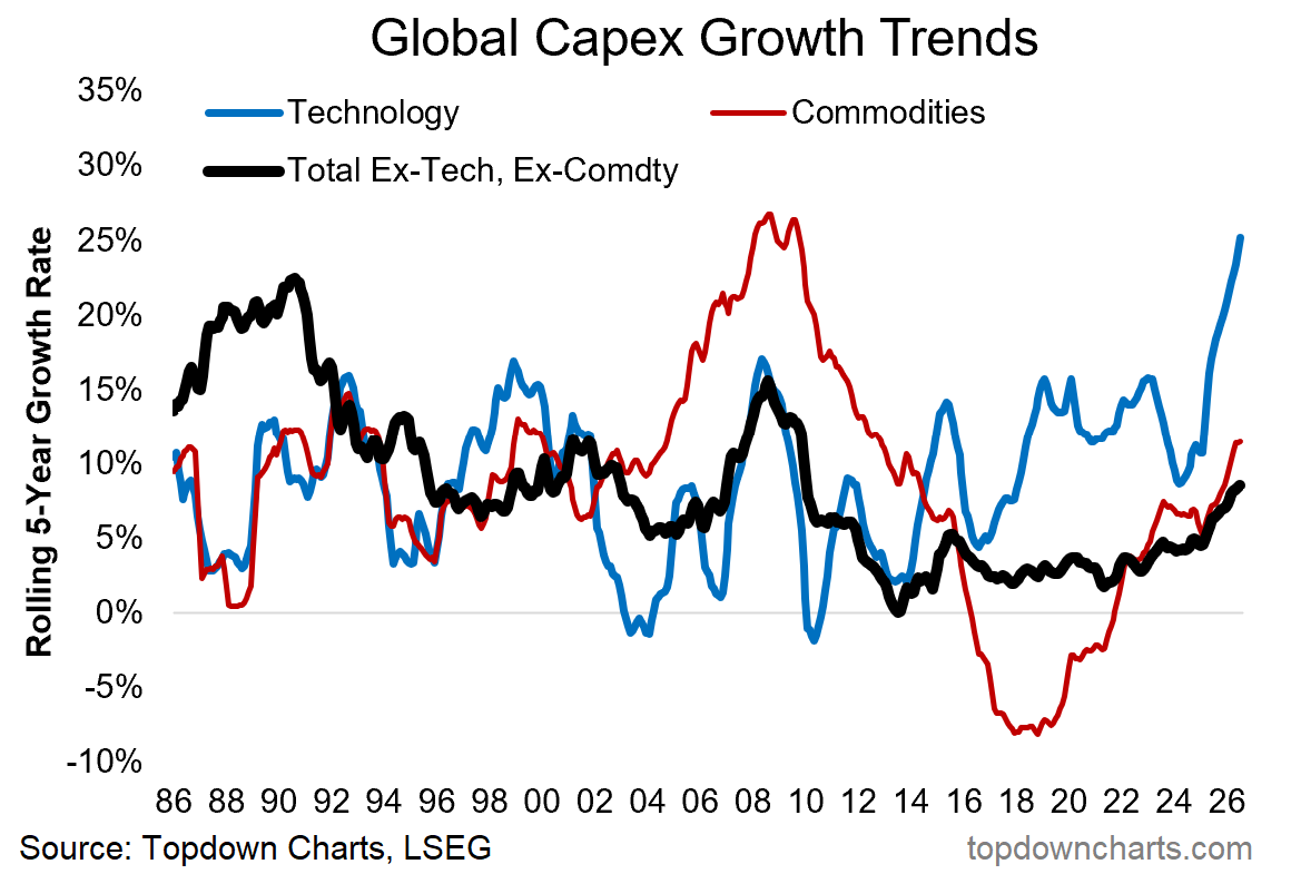
You can see the surge in commodity capex during the 2000’s Commodity Supercycle in the chart below (and subsequent contraction as the cycle ended):
But as to why bond yields and capex growth should move together, it’s both direct and indirect (remember: 2 lines on a chart only make sense if there is actual economic logic to it).
Direct: higher rates of capex growth require more funding, and that raises demand for funding —the price of debt funding is interest rates. Demand goes up, rates go up.
Indirect: higher rates of capex growth tend to occur during economic booms, and both reflect-and-drive stronger growth and inflation; which puts upward pressure on bond yields.
Capex growth is highly cyclical, and has a strong tendency to be boom-bust.
As for what’s happening right now, capex is in the boom phase. The biggest driver is US tech, but it’s not isolated to tech (we’re also seeing growth picking up in commodity sectors, and other sectors like industrials, utilities, and consumer sectors), and it is not isolated to the US (strong upturn in Emerging + Developed markets too).
This echoes my comments about global growth and commodities from last week (global growth reacceleration and overheating).
And overall it means with global growth, inflation, commodities, and capex all moving higher, the pressure on bonds is likely to persist and hence we could still see further upside in yields.
But one of the key takeaways is to make sure capex growth is high on the watch-list for go-no-go on bonds.
Peak capex will probably coincide with peak bond yields.
When will Capex Growth Peak — What do you think?
(when will the capex boom end?)
Bonus Chart: Bond Yields & Cash Rates
Another piece of the puzzle is cash rates. As growth and inflation heat up, central banks have increasingly been pivoting back to rate hikes.
If we get enough central banks hiking rates enough, that will put the brakes on the global economy (and capex), and put a dampener on growth/inflation (+ultimately put a lid on bond yields).
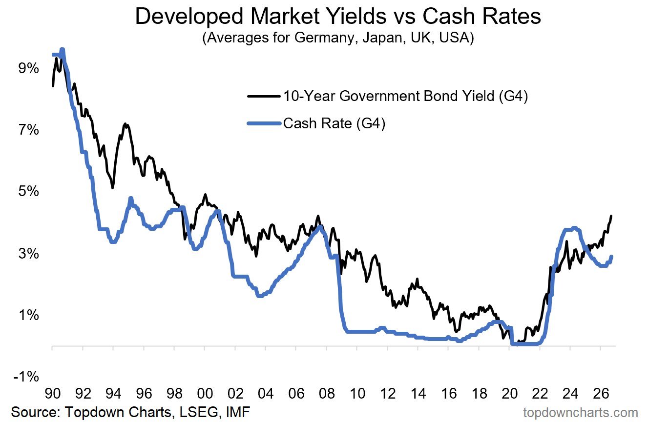
Somewhat counterintuitively, this chart tells us to look for peaks in bond yields when cash rates are being hiked, and troughs when cash rates are being cut.
The rate-cut cycle from 2024-25 is a key reason why bond yields are heading higher now (due to the stimulative effects on growth/inflation).
So how this current hiking cycle unfolds is going to be critical for macro & markets.
Weekly Report Notes
Here’s the topics & takeaways from my latest report —it should give a good sense of what I tend to cover in the Topdown Pro service as well as providing some high-level insights into how I am currently seeing Macro & Markets:
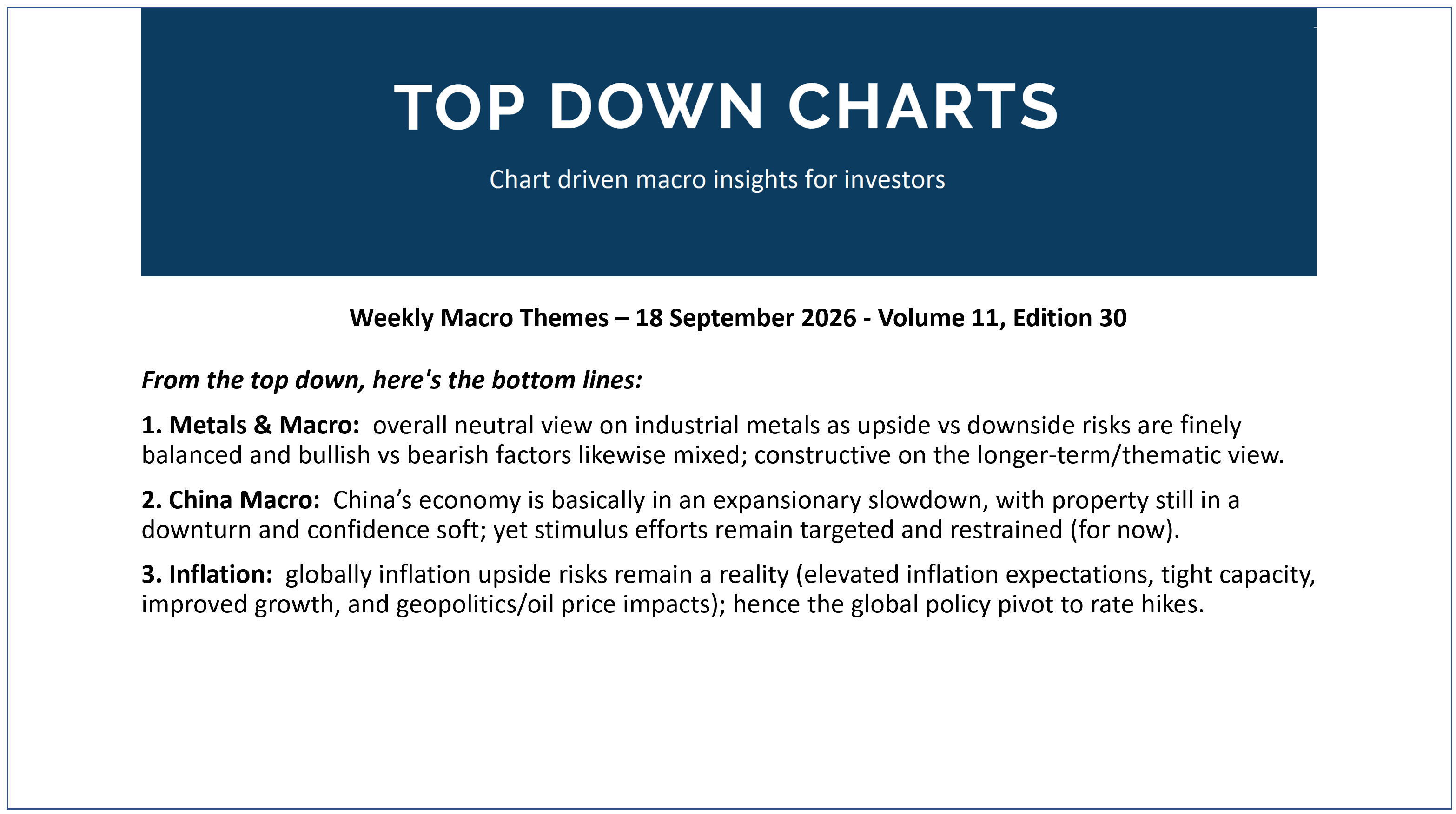
1. Metals & Macro: overall neutral view on industrial metals as upside vs downside risks are finely balanced and bullish vs bearish factors likewise mixed; constructive on the longer-term/thematic view.
2. China Macro: China’s economy is basically in an expansionary slowdown, with property still in a downturn and confidence soft; yet stimulus efforts remain targeted and restrained (for now).
3. Inflation: globally inflation upside risks remain a reality (elevated inflation expectations, tight capacity, improved growth, and geopolitics/oil price impacts); hence the global policy pivot to rate hikes.
Thanks for reading! Reply to this email if you have any questions.
—
Best wishes,
Callum Thomas
Head of Research at Topdown Charts
Connect: LinkedIn | Twitter/X | Substack
p.s. What do you reckon?
Please provide feedback below (reply by email if you had any specific points)
Also, in case you missed it: be sure to check out my previous note — in this post you will find more macro market musings +key charts on global equities.

Learn more about Topdown Charts —> this post explains what Topdown Charts does + The Topdown Charts Framework for monitoring macro & markets to consistently generate profitable ideas:
