

Reminder: the Q4 intake for Topdown Charts Professional is now open, Upgrade for deeper insights and actionable ideas — [upgrade to TD Pro now]
Chart: The Big Question for Bonds
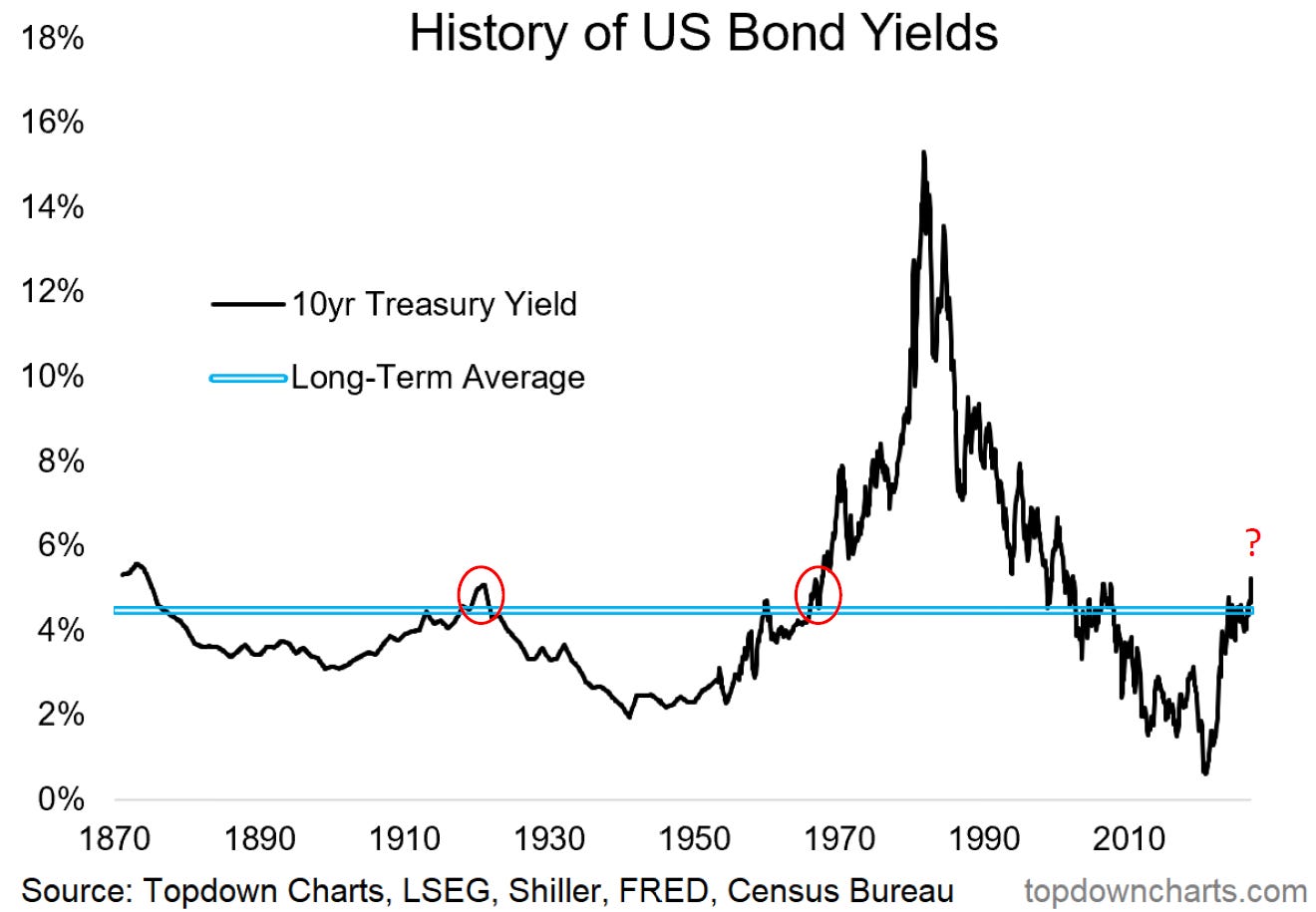
The big question for bonds is laid out plain and simple in this week’s chart.
The question = is this 1920? or 1967?
1920: US 10-year treasury yields poked their head above the long-term average, peaked shortly after, and then declined.
1967: US 10-year treasury yields broke above the long-term average and just kept going, peaking in the mid-double-digits.
Here’s why I think it’s worth probing: I see so many people arguing, with conviction, that this is the 1970’s all over again. The simplistic pattern recognition approach of: X happened back then, so it will happen again now.
But if you’re going to argue for a repeat of history, why not 1920?
(…also, what if the answer is neither?)
What if yields just stay around this level, they don’t surge higher like the 1970’s, and they don’t peak at a relatively lower level like the 1920’s, and instead just occupy a new higher range — kept elevated by some of the shocks and structural shifts the 2020’s have bought about, but ebbing and flowing on the macro pulse…
And then, to stretch our minds in a different dimension, there is the matter of time and cycle compression. In a situation of cycle compression you could still have a major bear market in bonds, but one that peaks and reverses just as fast as it began (i.e. it happens over months and years instead of decades).
So it’s more of a questions vs answers post this week, but sometimes the right question is what you really need —if you ask the right questions you get the right answers, the right thinking, the right framework, the right direction…
10-Year Bond Yield Outlook — What do you think?
(what do you think is the most likely path for [US 10-year] bond yields?)
Further Thoughts: Inflation vs Bond Yields
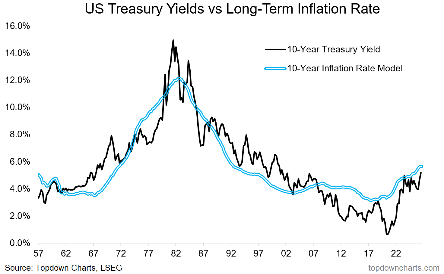
Taken in the simple lens of inflation, my long-term rate of inflation model basically dictates higher-for-longer at this stage. It would take a major shock for the long-term rate of inflation to fall radically from here, and it would equally take a much larger than currently experienced shock to the upside for this model to justify anything like what we saw in the 1970’s. So, just on this, and without knowing what future shocks may or may not come, it would look a lot like the “new higher range” scenario…
Upgrade for Actionable Insights
Sign Up for Topdown Charts Professional to get a flow of actionable investment ideas, portfolio relevant risk alerts, and meaningful macro insights to help you make better decisions with confidence + clarity.
For more info on the service check out the FAQ section (or reply with questions).
Weekly Report Notes
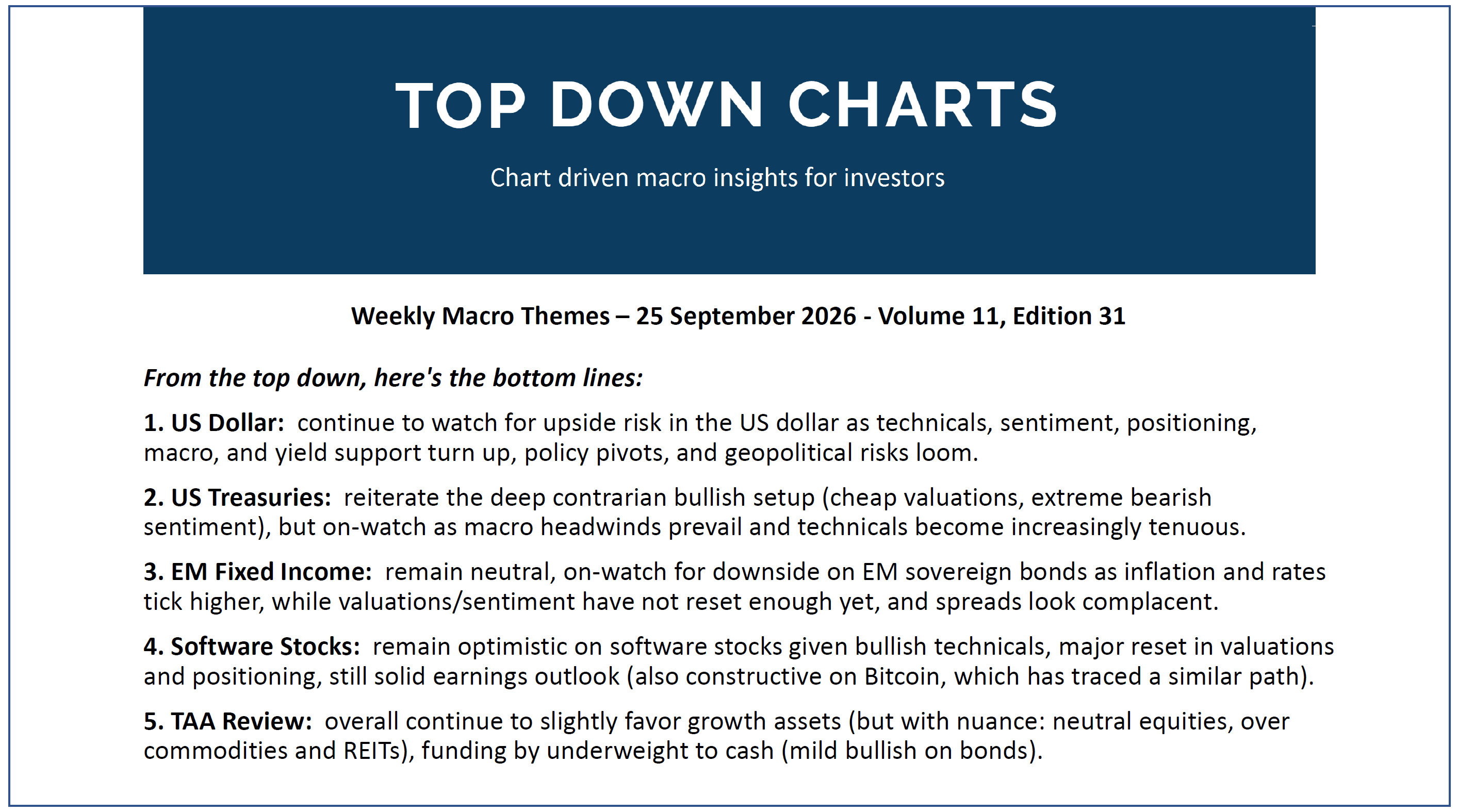
Here’s the topics & takeaways from my latest report —it should give a good sense of what I tend to cover in the Topdown Pro service as well as providing some high-level insights into how I am currently seeing Macro & Markets:
1. US Dollar: continue to watch for upside risk in the US dollar as technicals, sentiment, positioning, macro, and yield support turn up, policy pivots, and geopolitical risks loom.
2. US Treasuries: reiterate the deep contrarian bullish setup (cheap valuations, extreme bearish sentiment), but on-watch as macro headwinds prevail and technicals become increasingly tenuous.
3. EM Fixed Income: remain neutral, on-watch for downside on EM sovereign bonds as inflation and rates tick higher, while valuations/sentiment have not reset enough yet, and spreads look complacent.
4. Software Stocks: remain optimistic on software stocks given bullish technicals, major reset in valuations and positioning, still solid earnings outlook (also constructive on Bitcoin, which has traced a similar path).
5. TAA Review: overall continue to slightly favor growth assets (but with nuance: neutral equities, over commodities and REITs), funding by underweight to cash (mild bullish on bonds).
Gain instant access to the latest report + report archives + receive the Quarterly Strategy Pack this week >>> Subscribe Now: US$999/yr (72%-off the usual rate of $3500.00, deal ends 8th October 2026)
Thanks for reading! Reply to this email if you have any questions.
—
Best wishes,
Callum Thomas
Head of Research at Topdown Charts
Connect: LinkedIn | Twitter/X | Substack
p.s. What do you reckon?
Please provide feedback below (reply by email if you had any specific points)
Also, in case you missed it: be sure to check out the Top-down Investing Seminar — in this presentation I take you through how to take a top-down approach to global multi-asset investing to generate winning investment ideas. [View it Here]
Topdown Charts Research Digest — Archives
Click through for more free updates and insights from Topdown Charts:
Learn more about Topdown Charts —> this post explains what Topdown Charts does + The Topdown Charts Framework for monitoring macro & markets to consistently generate profitable ideas:
