

Note: this is a new series for free subscribers to give an insight into the work that goes on at Topdown Charts (+deliver some useful and timely takeaways).
Chart: Semiconductor Stocks
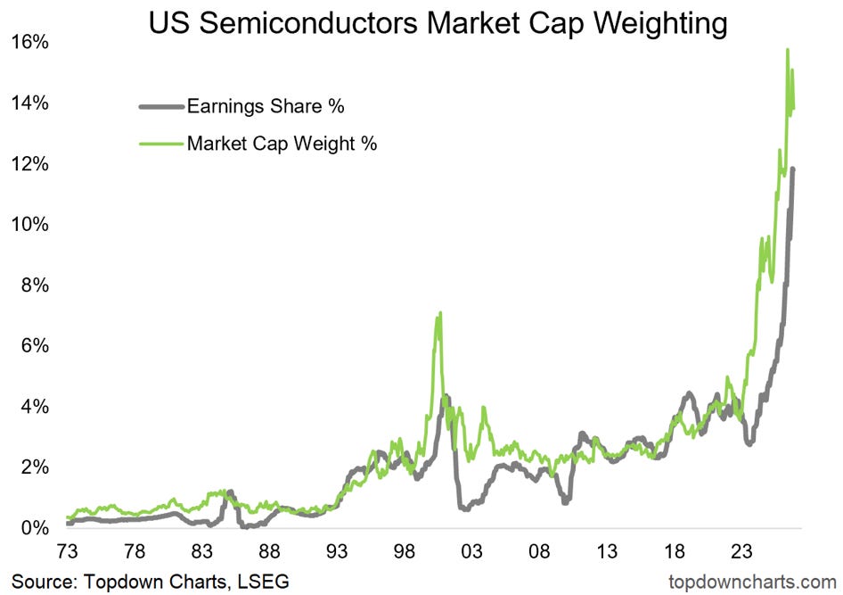
Depending how you look at it, this may be one of the most bullish or bearish charts out there on US semiconductors… and by extension one of the most important charts for the US stockmarket right now.
US Semiconductors’ market cap weighting has surged to record highs.
It brings immediate comparisons to the dot-com spike, but equally immediate counterpoints on how the earnings weight has also soared — the mantra is: it’s different this time because it’s backed by earnings.
But take a quick look at the chart… the dot com boom was backed by a surge in earnings weight too. So too was the lesser-known 1980’s semiconductor boom-bust cycle. This is a sector where boom and bust is the rule, not the exception (and a natural feature of disruptive tech adoption).
US Semiconductor Stocks — What do you think?
(what’s your core-view/how are you positioned in US semiconductor stocks?)
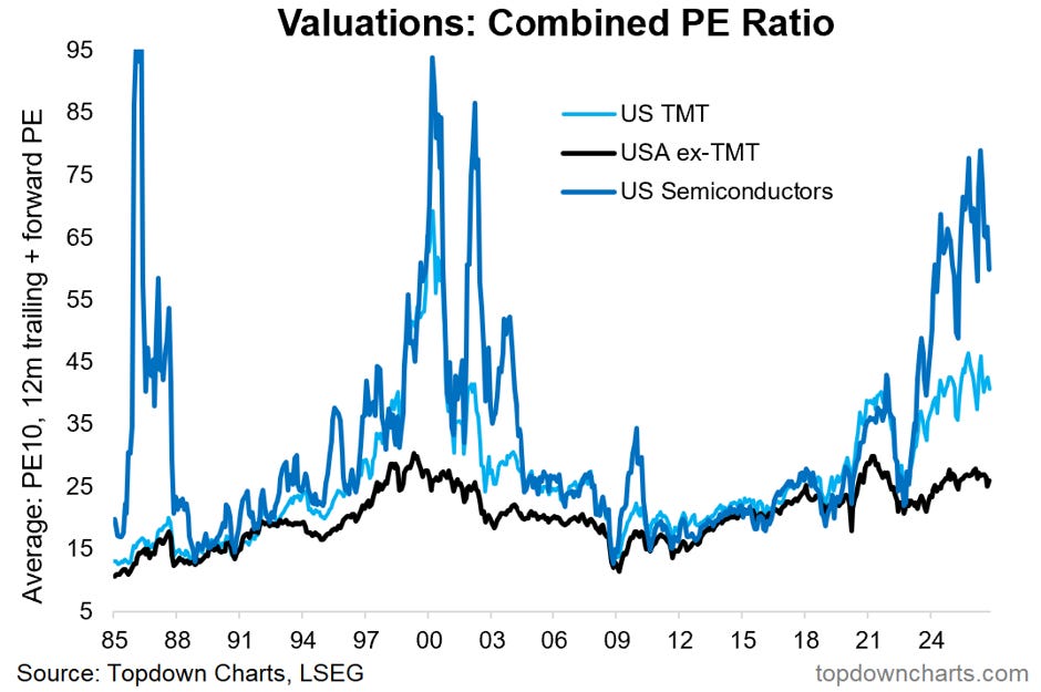
Bonus Chart: US Equity Valuations…
Similar to Korean Equities (as discussed last week), US semiconductors’ combined PE ratio soared to levels similar to those seen during some of the previous major boom/bust cycles. Basically this is the gap between market cap weight and earnings weight, and it represents the anticipation aspect…
i.e. in the chart above the green line leads the grey line on the way up —the earnings story does justify the move in stock prices, but the current level of earnings matters less than the expectation of the future level of earnings.
That’s where things can get unstuck. The more you bid up valuations, the greater the scope for disappointment if earnings fall short of expectations …or even worse: if the earnings boom turns to bust (either through a period of overinvestment vs immediate-term demand, or through an economic downturn [or both]).
As I’ve said before: “Bulls, Booms, and Bubbles start with good reason, and end when things get unreasonable...”
Weekly Report Notes
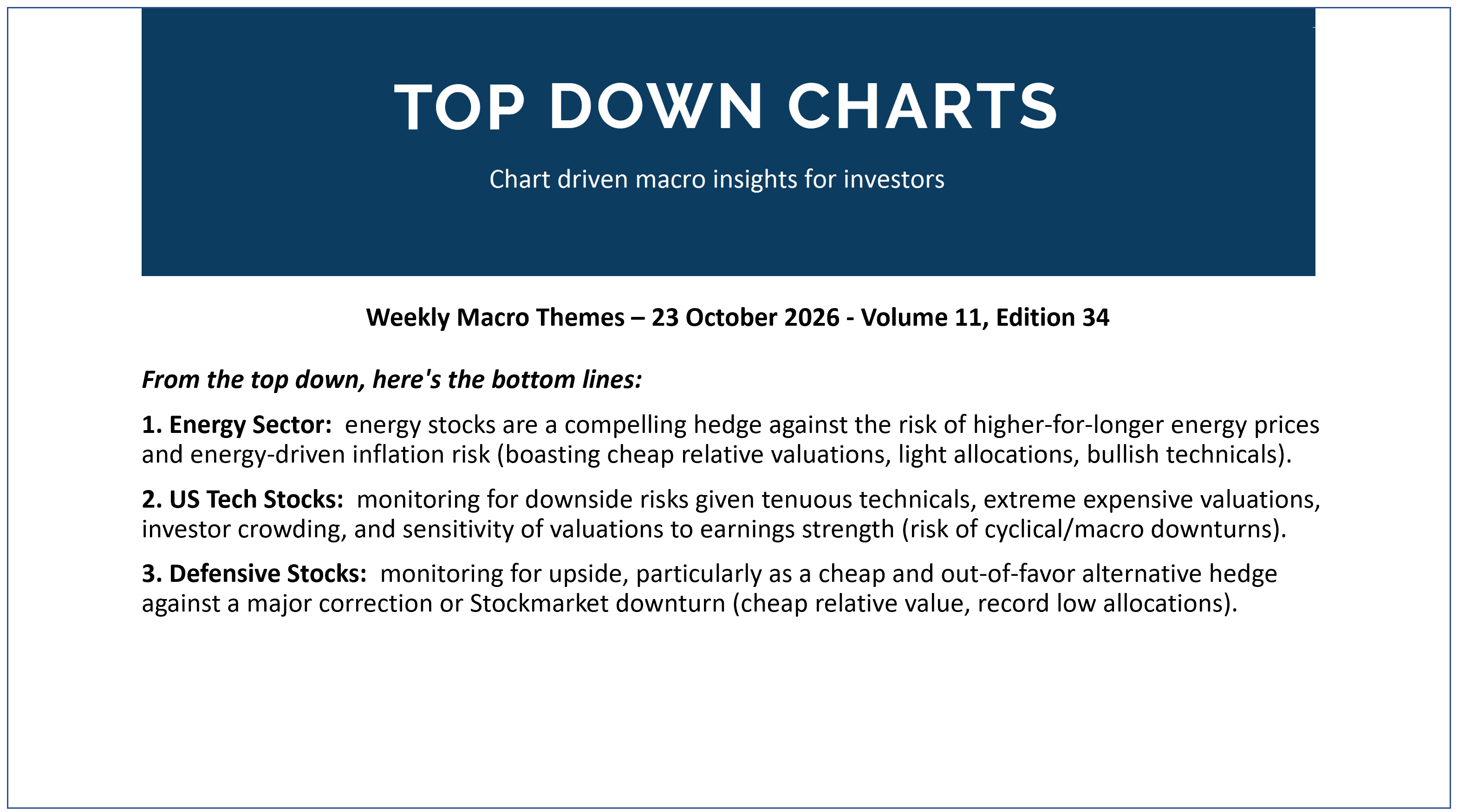
Here’s the topics & takeaways from my latest report —it should give a good sense of what I tend to cover in the Topdown Pro service as well as providing some high-level insights into how I am currently seeing Macro & Markets:
1. Energy Sector: energy stocks are a compelling hedge against the risk of higher-for-longer energy prices and energy-driven inflation risk (boasting cheap relative valuations, light allocations, bullish technicals).
2. US Tech Stocks: monitoring for downside risks given tenuous technicals, extreme expensive valuations, investor crowding, and sensitivity of valuations to earnings strength (risk of cyclical/macro downturns).
3. Defensive Stocks: monitoring for upside, particularly as a cheap and out-of-favor alternative hedge against a major correction or Stockmarket downturn (cheap relative value, record low allocations).
Thanks for reading! Reply to this email if you have any questions.
—
Best wishes,
Callum Thomas
Head of Research at Topdown Charts
p.s. What do you reckon?
Please provide feedback below (reply by email if you had any specific points)
Also, in case you missed it: be sure to check out the previous note — in this post you will find more macro market musings + a key chart on Korean stocks [and last week’s survey results!!]

Learn more about Topdown Charts —> this post explains what Topdown Charts does + The Topdown Charts Framework for monitoring macro & markets to consistently generate profitable ideas:
